 |
|
 Oct 18, 2010, 04:34 PM // 16:34
|
#741 |
|
Desert Nomad
Join Date: Jun 2005
Location: USA
Guild: Kirins of Holy Light
Profession: N/
|
Yep. If he is sitting behind MKT giving cues to the audience it would already be implied that it is for everyone to do so just the actual command is needed.
@ Dutch. If the end of the bricks on the left side are indicating a corner of a building the white grout part should be indented. |

|

|
 Oct 18, 2010, 04:37 PM // 16:37
|
#742 | |
|
Furnace Stoker
Join Date: Dec 2006
Guild: [Bone]
Profession: Mo/
|
Quote:
 
|
|

|

|
 Oct 18, 2010, 04:52 PM // 16:52
|
#743 | |
|
Frost Gate Guardian
Join Date: Dec 2009
Guild: GWO
Profession: W/Mo
|
Quote:

|
|

|

|
 Oct 18, 2010, 04:55 PM // 16:55
|
#744 |
|
Ascalonian Squire
Join Date: Oct 2005
Profession: W/R
|
Guild Wars Halloween Art Contest 2010
http://www.guildwars.com/events/contests/halloween2010/ Well I've entered the contest finally. My entry is done, and I sent it off, so I feel confident it won't get stolen as an idea. In the link below I set up a progression page. I had a lot of fun doing it, and even if it doesn't win, I can still display it. Feel free to comment. Guild Wars 2010 Halloween Art Contest Progression Page http://home.comcast.net/~guildbluudlust/gwhac2010.htm In-Game-Name:"Merciless Evilphire" Art Form: Engraved Sculpture Idea: Aatxe Skull Project Total Hours:45 Official Contest:  Art Piece Dimensions: 20" wide horn tip to horn tip 21" Long from base of Skull to tip of nose plate 9" High from lower to upper skull portion Weight:12.lbs Last edited by Sordrax; Oct 21, 2010 at 01:46 PM // 13:46.. |

|

|
 Oct 18, 2010, 04:56 PM // 16:56
|
#745 | |
|
Site Contributor
Join Date: Aug 2010
|
Quote:
I LOVE LOVE LOVE this pic (razah is my fave hero, and the subject of my next short story)! I am so amazed at how you can do this practically overnight! I can't wait until you're done, because I am soooo saving this and putting it as my desktop halloween wallpaper! <jumping up and down with orange and black pom poms> edit: Sordrax, congratulations on getting your entry done and submitted  It looks so cool, and I love how you have the sweetness of a rose and the violence of a mace to enhance the skull! Gorgeous! It looks so cool, and I love how you have the sweetness of a rose and the violence of a mace to enhance the skull! Gorgeous!
Last edited by Thistle Xandra; Oct 18, 2010 at 05:20 PM // 17:20.. |
|

|

|
 Oct 18, 2010, 06:10 PM // 18:10
|
#746 |
|
Lion's Arch Merchant
Join Date: Apr 2007
Location: Czech Republic-Prague
Guild: [LUST]
Profession: R/
|
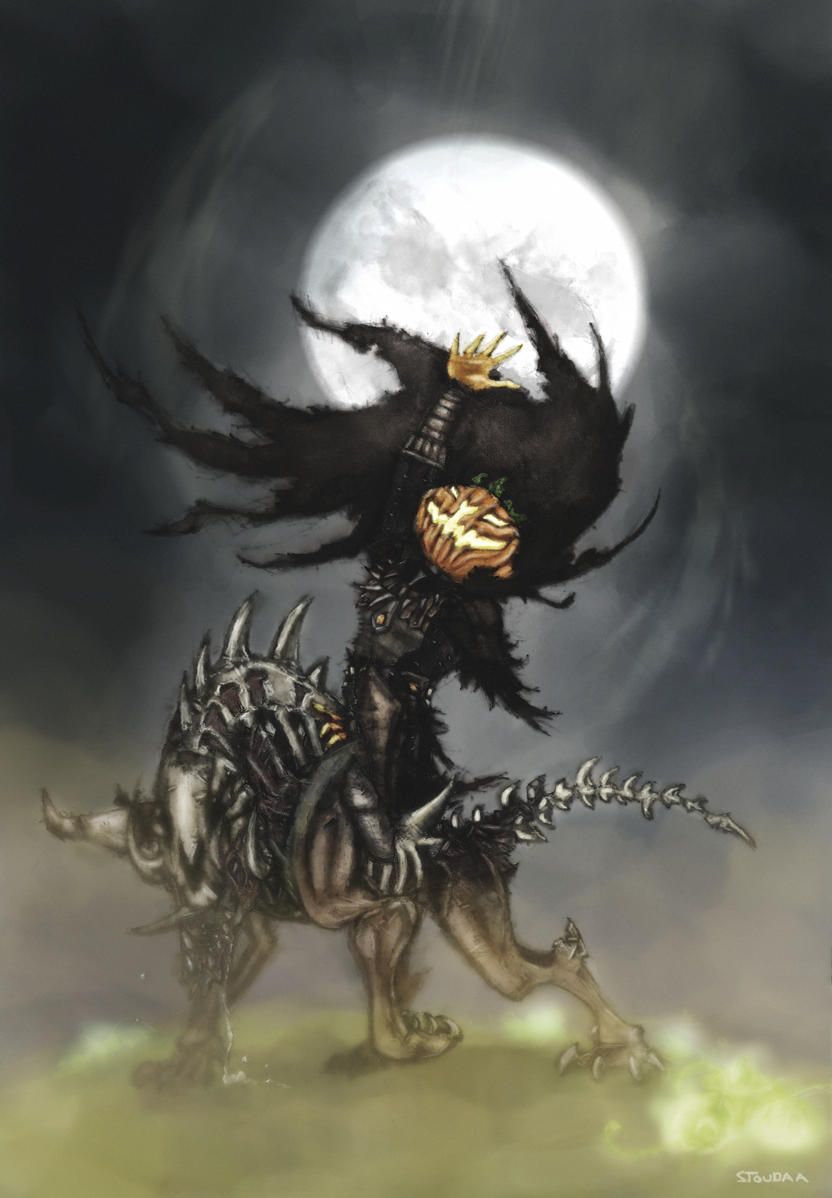
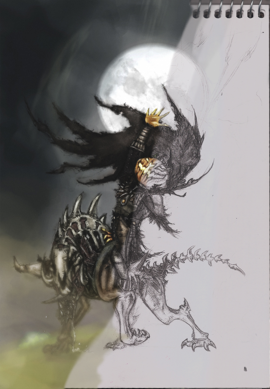
final: before/after: progress gallery: http://stoudaa.deviantart.com/ yep, Im totally done, i thought ill wait till 21st to submit it so i can have some time to edit/add few things but i didnt really know what O: i just added few ghosts and thats it |

|

|
 Oct 18, 2010, 06:34 PM // 18:34
|
#747 |
|
Ascalonian Squire
Join Date: Aug 2008
Location: Northern Ireland, United Kingdom
Guild: Freaks Of Society [FoS]
Profession: Mo/Me
|
|

|

|
 Oct 18, 2010, 06:59 PM // 18:59
|
#748 |
|
Site Contributor
Join Date: Mar 2008
Location: UK/norway
Guild: Order Of The Etherbloom Crown [ZEN]
|
OMFG, there are so many delicious entries this year, I can't believe my eyes.
 Although judging will be hard, I now feel especially good about the funds I personally donated to the workshop, and especially thankful for all the donations. I feel like these rewards will be delivered to more than deserving hands.  I'm quite happy to say that I've managed to finish Eir. ^^ I still have some bits and bobs to correct, but I can do them within an hour tonight before going to bed. Here are some of the costume bits: Given how little time I spent on it I think it looks alright, but of course there are a lot of things I wish I'd done better (and I wish I had more leatherette to work with Q_Q). You can probably see the areas where there should be leather texture and there isn't, I just hope it's not too obvious when i put the whole thing on. Wolfie has a bump on him which I didn't notice before now, I guess I'll file that down. The bow will have to be made later, so no weapon this year  hopefully I'll make one to celebrate the release of GW2 though. ^^ hopefully I'll make one to celebrate the release of GW2 though. ^^Photos tomorrow evening for me. |

|

|
 Oct 18, 2010, 07:08 PM // 19:08
|
#749 |
|
Desert Nomad
Join Date: Jun 2005
Location: USA
Guild: Kirins of Holy Light
Profession: N/
|
A goofy little rush edited video. http://www.youtube.com/watch?v=0w7bf4ZSe4c Need to record more footage and make better videos tomorrow.
|

|

|
 Oct 18, 2010, 07:12 PM // 19:12
|
#750 |
|
Frost Gate Guardian
Join Date: Dec 2009
Guild: GWO
Profession: W/Mo
|
You're going to make a movie with that? Are you going to use that sound? Because they might disqualify you because of that...
|

|

|
 Oct 18, 2010, 07:43 PM // 19:43
|
#751 |
|
Wilds Pathfinder
Join Date: Sep 2009
Guild: ...
Profession: W/
|
Thanks for the advice guys. I'll try to get at making this stuff later in the week. School and stuff to do for now though x/
I'll try and have another mockup by wednesday-ish. @Dutch: Any ideas on how to make the paper look more realistically ripped? No matter what I try, it keeps looking artificial :x And as for the nail, it just seems like nothing is working xP |

|

|
 Oct 18, 2010, 08:26 PM // 20:26
|
#752 |
|
Pre-Searing Cadet
Join Date: Jul 2009
Guild: Stay Fly (fly)
Profession: D/Mo
|
Okay so I've gotten everything but the roof pieces on, let me know what you think! It should look like the haunted house in Kamadan when I'm done. Gallery: http://loveangelmaybe.deviantart.com/#/d30zb1j |

|

|
 Oct 18, 2010, 08:38 PM // 20:38
|
#753 |
|
Furnace Stoker
Join Date: Dec 2006
Guild: [Bone]
Profession: Mo/
|
Lol Koreena, that vid is epic, I smiled so big at Mad King laughing
 And Stouda damn that turned out to be great. Really great job. And Stouda damn that turned out to be great. Really great job.
|

|

|
 Oct 18, 2010, 08:47 PM // 20:47
|
#754 |
|
Wilds Pathfinder
Join Date: May 2009
Location: Canadaa!
Guild: Last Friday Night [TGIF]
Profession: E/
|
Minami - O:!!! WOW. RAZAH = LOVE. U:< <33333!! I'm so amazed at how much you've gotten done 0_0! I like this idea a lot more o:! I'll still googly-eye your first pic, though XD <3
Tommy - Omgsh I can't get over how much I love the giant pumpkin @_@ -bakes into pie- The hanging pumpkin light kind of confuses me, though. I guess it's just where the string is placed, though :S Dutch - Wow I like the spider web a lot! Maybe you could add tiny highlights to the branch above the lantern? Sordax - WOW O_O! Wowwowowo @ w@ You must have a super steady hand for those lines. xD <3 Stouda - Ouu the before/after picture is neat C: Lil Thing - Looks good~! I love the pumpkins c; Tzu - O:! Ouu. >__> <__< That would be a cool bra to wear after... Kiya - XD Omg. That video. <3 LOVE. Angel - omgsh that looks delicious >O>! -noms pocky- |

|

|
 Oct 18, 2010, 08:51 PM // 20:51
|
#755 | |
|
Furnace Stoker
Join Date: Dec 2006
Guild: [Bone]
Profession: Mo/
|
Quote:
 But its good now! But its good now!  Having some trouble with the perspective of the roof of the little windowtowerthingie. Damn that thing. Hoping to get some time to fix that and add some more detail to the ground and the text on the signs, the text looks a bit too perfect  Suggestions welcome <3 Suggestions welcome <3
|
|

|

|
 Oct 18, 2010, 10:26 PM // 22:26
|
#756 |
|
Desert Nomad
Join Date: Jun 2005
Location: USA
Guild: Kirins of Holy Light
Profession: N/
|
Maybe the Brushed or Jangly Walk ones here? http://www.1001freefonts.com/brush-fonts.php
|

|

|
 Oct 18, 2010, 10:50 PM // 22:50
|
#757 |
|
Ooo, pretty flower
Join Date: Jan 2008
Location: Citadel of the Decayed
Guild: The Archivists' Sanctum [Lore]
Profession: N/
|
Tommy's: I would suggest removing the / personally. It just seems rather out of place on the sign. But it's probably my personal taste and can work both ways.
|

|

|
 Oct 19, 2010, 12:20 AM // 00:20
|
#758 |
|
Jungle Guide
Join Date: Jul 2009
Guild: The Kurzick Mob [Mob]
Profession: R/
|
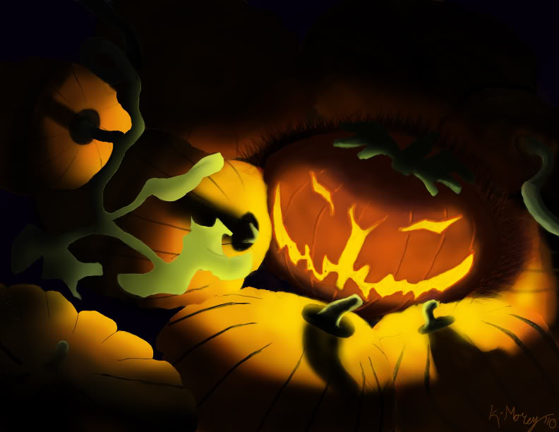
So this was what I did yesterday night. I had some ideas for texture today but needed to distract myself so I've just been watching TV for hours :P We had a physics test and our teacher forgot to tell us her clock was 20 minutes slow >.> Anyways after how i met your mother I'm gunna attempt the texture dealy, if it doesnt work out I wont fret hard about it. i should also fiddle with the vine. edit: worked abit since last post sooooo Last edited by Death By An Arrow; Oct 19, 2010 at 02:39 AM // 02:39.. |

|

|
 Oct 19, 2010, 02:47 AM // 02:47
|
#759 |
|
Site Contributor
Join Date: Aug 2010
|
Eek, running behind again and only got to comment on Minami's work on my beloved Razah <3
@ Dutch Sunshine: loving it! The cracks in the wood are a huge improvement. I hadn't even noticed that was wood until this version O_O I'm still not a fan of the pumpkin though. Maybe the texture idea that people keep mentioning for Death by Arrow would make it more detailed so it matches the rest? I really love that tengu poster in the back btw! Just out of curiosity, now that I've seen Shy Guy's poster with the nail in it, what would you use to attach posters to brick? @ stouda: That before/after pic is really nice  I love when artists do that! I love when artists do that!@ lil thing: very nice! I really like how you did your shading, especially on the cauldron… really gives it a 3D feel  @ tzu: omg, that is one sexy costume! @kiyaKoreena: that vid was so cute and really made me laugh! priceless! on a side note, I thought youtube added elevator music while the video was buffering, but it turned out to be one of those axe commercials running on this site D: @ Love angle: how yummy! I was wondering how you got the white part so perfect… is that how fondant really is or are you using some super trick?! I love your mad king's guards in your pic gallery by the way  That's so clever how you did that! That's so clever how you did that! @Tommy: I wish there was a way to make the black against black not happen. Like, it's so hard to see his outline against the black door, and that spider outline is so hard to see. When I first opened it up, it looked like you had added really long bug antennae, but it turned out it was just me automatically connecting the stems on the top and the two spider legs on the right of the window. I really like the scarecrow you added in the window. For the sign, I would pick /clap or /cheer instead of /kneel for a subliminal positive reaction since clap is more for happy while kneel is more submissive and negative. Your pic is looking really good other than those minor things for me  @Death: That looks great! It was so fun watching your pic progress pumpkin by pumpkin! (Side note, that's terrible about your test!!) @Death after edit with texture attempt 1: I don't like those textures  I'd rather have 'worked on vine and smooth pumpkins' before working on texturing I'd rather have 'worked on vine and smooth pumpkins' before working on texturing 
|

|

|
 Oct 19, 2010, 03:42 AM // 03:42
|
#760 | |
|
Jungle Guide
Join Date: Jul 2009
Guild: The Kurzick Mob [Mob]
Profession: R/
|
Quote:
tomorrow is working on the vine night, because then i'll be finished  im free all tomorrow night, school trip wednesday morning; no homework has to get done tomorrow :P ... and then i've gotta start my wintersday piece! /laugh |
|

|

|
 |
|
«
Previous Thread
|
Next Thread
»
| Thread Tools | |
| Display Modes | |
|
|
All times are GMT. The time now is 04:54 AM // 04:54.


 Linear Mode


